Untitled Debut
Tuesday, October 13, 2015
Sunday, October 11, 2015
Poster Design Choices
These are done, but I'm having a tough time deciding between these two slightly different versions. The only changes are in the bottom right corner, but I think it makes a big difference. Thoughts?
Monday, October 5, 2015
AJMF Concepts
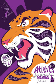
For my first concept, I wanted something that felt fierce and loud. The band names are worked into the stripes of the tiger and would be hand written. The entire piece would have an organic, yet psychedelic feel.
The next piece is based on retro jazz artwork, and is designed in such a way as to be interesting even when rotated 180 degrees.
The final piece is a bit more random, but I think it would be a fun poster. I'm having a bit of trouble getting the colors just right, so suggestions are appreciated!
Tuesday, September 22, 2015
Television Series promotional posters
For our assignment, I decided to focus on two very different shows that I absolutely adore, one being animated and the other being live action. My intent this semester is to continually push myself to create different styles and use different techniques in my work, and I hoped that these variations in subject matter would lend themselves well to meeting my goals.
For this first poster, I wanted to create something that felt true to Steven Universe while also being more than a simple illustration. My fear was that had it just been drawn out digitally, it would've come across as looking too much like something made in-house. The solution I came up with was to create a paper cut-out version of my original drawing. Aside from the text and some minor details, the piece was entirely made from cut construction paper. I also used the tagline to make allusions to the style of the poster itself, using words like stacked and cut, while still referencing the content to be tackled in the upcoming season.
For my second poster, I wanted to capture the essence of the show, which is darkly humorous and comic-based. The intro credits for iZombie, as well as some of the commercial break screens, are done in an illustrated, half-tone comic style. Keeping with this feel, I decided to take a photo and then edit it to have some comic style elements. The photo itself is heavily based on the series as well: the main character often eats brains while on the job at the morgue, wearing purple latex gloves and using chopsticks. The 'brains' here are made from sculpey, and the 'blood' created using Nyquil and maple syrup. This was a bit of a challenge for me, as I don't do much photography or photo editing. I'm very pleased with the final result.
Thursday, September 3, 2015
Wednesday, August 26, 2015
I've always appreciated humor in commercials. Some of my all time favorites:
This commercial aired during the Super Bowl over 10 years ago, and I've never forgotten it. I did, however, forget who the ad was for. He's wearing a Reebok logo necklace, but other than that and the website name at the end, it doesn't actually do a good job of instilling a memorable brand experience. Since the video did go viral though, I'm sure that more than did it's job.
This Old Spice campaign was not only different, funny, and memorable, but it also actually lead to my husband buying their product. They did a very effective job of making a previously bland product seem relevant again.
Wednesday, April 29, 2015
Subscribe to:
Posts (Atom)


